
Guide
How to write a design brief.
A brief is not a wish list, it is the set of facts a designer needs before they can make a decision without asking you. Below is what goes in each section, why it matters, and the difference between a line that sounds fine and a line that is actually usable.
Section 1
Overview and goals
What should this project achieve?
One or two sentences on what has to be different after the work is done. Not the deliverable, the outcome the deliverable is for.
A designer can only choose between two good options if they know what the work is for. Without a goal, every decision comes back to you as a question, and the answer arrives three rounds too late.
Sounds fine, says nothing
We need a new logo.
Usable
We sell to architects and our current mark reads as a toy brand at small sizes on drawings. It should still be recognisable at 16 px and look at home next to engineering firms.
Section 2
Target audience
Who is this for, specifically?
The people who will see the work, in the terms you would use to find them. Where they meet the brand matters more than their age.
Audience is the single answer that settles the most arguments later. Half of the taste questions on a project are really audience questions in disguise.
Sounds fine, says nothing
Everyone. Mostly younger people.
Usable
Practice owners between 35 and 55 who compare three suppliers on a phone at the end of a working day, and who have been burned by a cheap rebrand before.
Section 3
Brand story and voice
What does the brand stand for, and how does it speak?
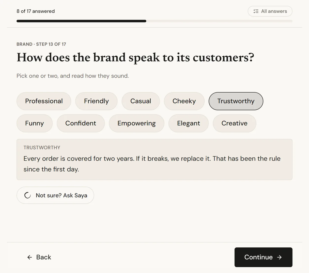
The name, the category in plain words, and how the brand sounds when it talks to a customer. Pick a voice and read a sample of it out loud.
Voice is where briefs quietly disagree with themselves. A brand described as warm and human in one line and as authoritative in the next makes every headline a negotiation.
Sounds fine, says nothing
Professional but friendly. Modern.
Usable
Plain and direct, the way a good tradesperson talks: short sentences, no superlatives, never says solutions. Warmth comes from being useful, not from exclamation marks.
Section 4
Style
What should it look like?
A direction, not a design. Pick from pictures wherever you can, and say what the picture is doing that you like.
Style words are the least reliable part of any brief. Editorial, premium and clean mean something different to every person who reads them, and nobody notices the misunderstanding until the first presentation.
Sounds fine, says nothing
Clean, modern, premium.
Usable
Like the middle reference: a lot of white space, one strong photograph, type doing the work instead of decoration. Not the third one, that ornament is too much for us.
Section 5
Colour
Which colours are fixed, and which are open?
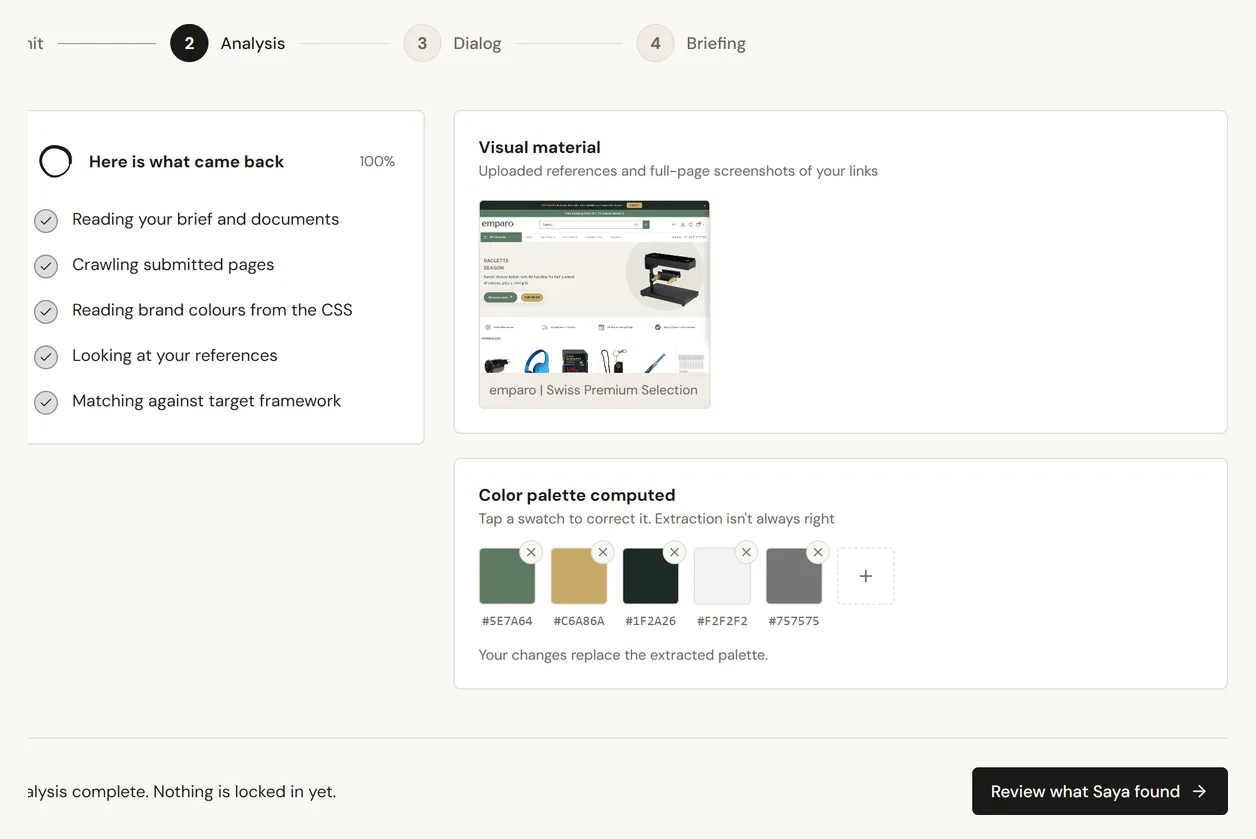
The colours you already own, as values rather than names, and how far a designer may move away from them.
Almost every brand already has colours in use somewhere, and the brief is where they either get written down or get reinvented. Reinventing them costs a round of revisions and sometimes a reprint.
Sounds fine, says nothing
Our blue, plus something fresh.
Usable
The blue on our website header stays, everything else is open. Avoid green, our biggest competitor owns it in this market.
Section 6
Scope and deliverables
What exactly is being delivered?
The list of things you expect to receive, with formats and quantities where they matter. Print runs, sizes, platforms, number of variants.
Scope is what a quote is built on. A brief without it does not get four comparable quotes, it gets four different assumptions, and the cheapest one is usually the one that assumed the least.
Sounds fine, says nothing
A logo and some brand stuff.
Usable
Primary logo plus a horizontal version and an icon, in SVG and PNG, with a one page usage sheet. No stationery, we print nothing.
Section 7
Budget and timeline
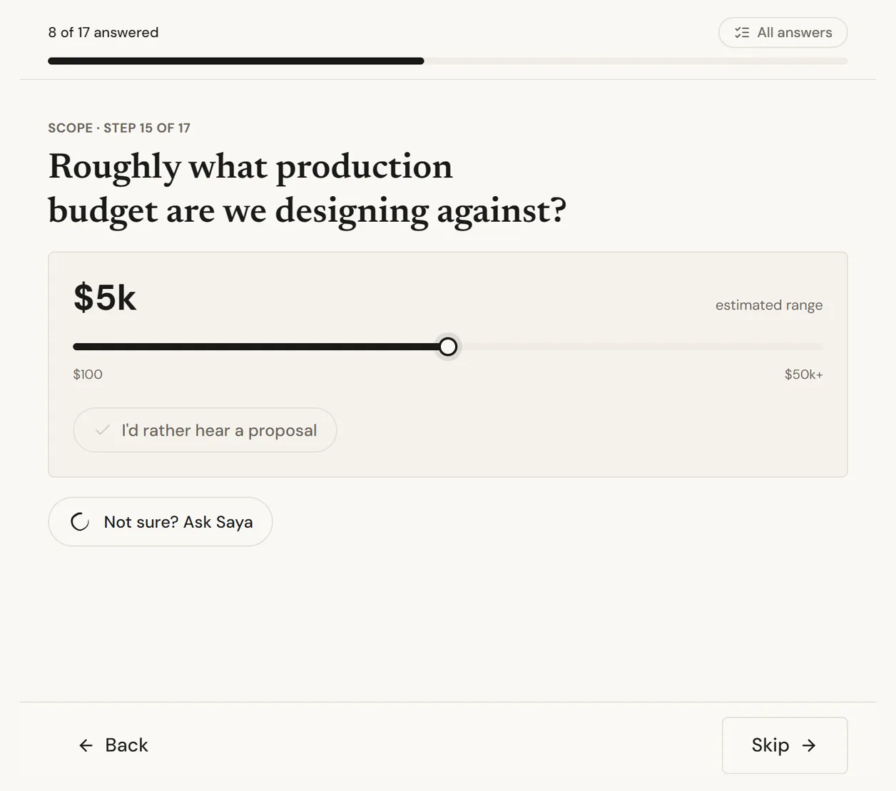
What is the money and what is the date?
A range is enough, and so is saying that the figure is open. If a date is fixed by something real, name the thing.
Leaving the budget out does not get you a better price, it gets you proposals aimed at the wrong bracket. And a deadline without its reason cannot be negotiated when something has to give.
Sounds fine, says nothing
We are flexible. As soon as possible.
Usable
Between 4,000 and 6,000, open to a proposal if it changes the scope. The trade fair is on 14 March and the stand graphics go to print three weeks before.
Section 8
Do's and don'ts
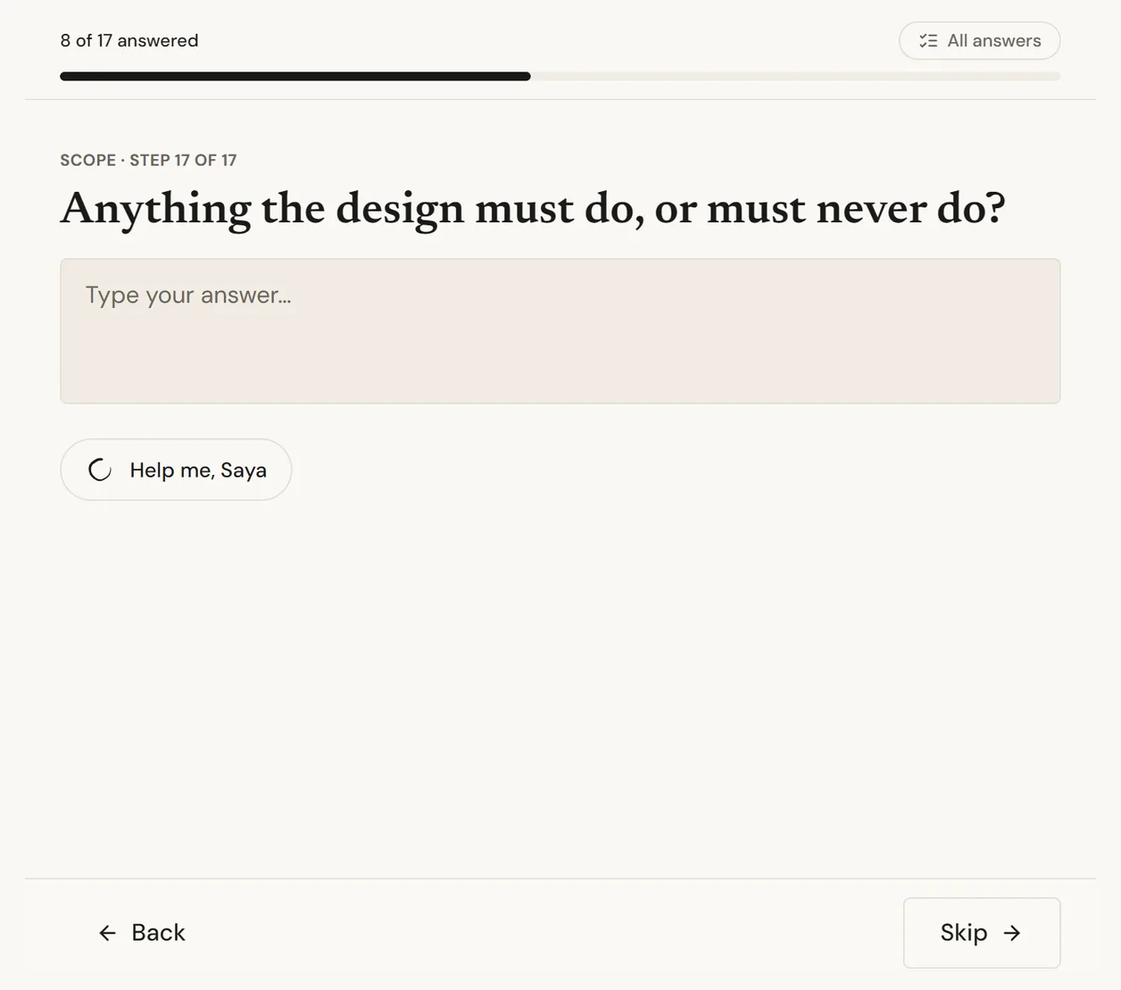
What is out of bounds?
The constraints that are not up for discussion, and the things that have already been tried and rejected.
This is the cheapest section in the whole brief. Every line here is a revision round that does not happen.
Sounds fine, says nothing
Nothing too crazy.
Usable
Must work in one colour for embroidery. Never use the mascot, it was retired after a complaint. No stock photography of people in hard hats.
Section 9
References and moodboard
What have you seen that works?
Links or images, each with one line on what you are pointing at. Counter examples are just as useful as favourites.
A reference without a sentence is a trap. Nobody can tell whether you sent it for the layout, the colour or the photography, and a designer who guesses wrong has done the wrong work carefully.
Sounds fine, says nothing
Here are a few sites we like.
Usable
This one for how the navigation stays out of the way. This one for the photography only, the type is far too loud for us.
Section 10
In the client's own words
What did the client actually say?
The original message, pasted in unedited, even when it is messy.
Every summary loses something, and it is never the part you expected. The verbatim text is where a designer finds the sentence that explains what the tidy version left out.
Sounds fine, says nothing
Client wants it to feel more premium.
Usable
Paste the whole email. The line about their biggest customer calling the packaging cheap is worth more than the word premium.
Three mistakes that survive every review
Describing the solution instead of the problem
A brief that already specifies a blue sans-serif logo has thrown away the part you are paying for. Say what has to be true at the end, and leave how open.
Writing adjectives where an example belongs
Modern, clean and premium survive every review meeting because nobody disagrees with them. That is exactly why they decide nothing. One reference with a sentence beats ten adjectives.
Leaving out the money
An unnamed budget does not stay open, it gets guessed at. The guess is usually wrong in both directions, and the correction costs a round of work that somebody has to pay for.
Or have it asked of you
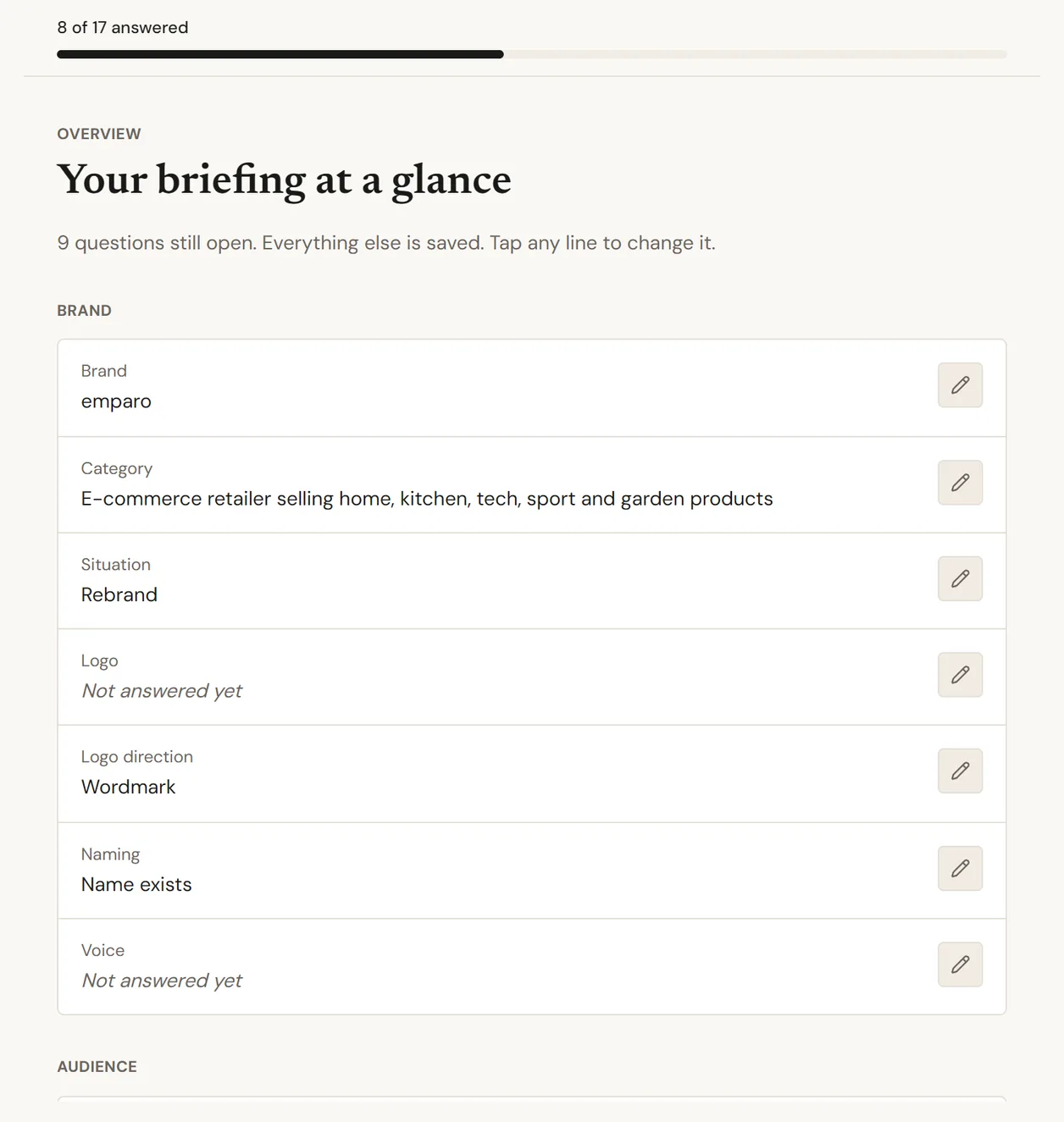
Sosai asks these questions one at a time, reads whatever you already have, and hands back the finished brief. Free, for as many projects as you like.
Try it for yourself
A website, a few lines about the project, the email your client sent you, or nothing at all. Anything is a start.
See finished briefs first, if you would rather look than start.